Network Psychometrics vs. IRT: Does Centrality Track Discrimination?
IRT explains why items correlate with a single latent trait; network psychometrics explains it with a graph of direct partial-correlation edges between items, no latent variable required. Under a strong single common cause, the two should agree: a network’s node centrality should track IRT discrimination, and the network should look densely and uniformly connected. We test this across real IRW instruments and check whether the relationship tracks tables already flagged as multidimensional or locally dependent elsewhere on this site.
Published
October 23, 2026
Note
This vignette — including the dataset search, the compute script, the analysis design, and the writing below — was produced largely by Claude (Anthropic), working from a task specification and with human review. Treat the methodological choices and interpretations accordingly, and check the compute script (network_psych_compute.R) directly if you’re relying on the numbers here.
Motivation
Every other vignette on this site treats item covariation the same way IRT does: responses correlate because they all depend, more or less, on one latent trait. Network psychometrics proposes a different account. Instead of a shared cause behind the correlations, it models items as nodes in a graph and estimates direct, partial-correlation edges between them — an Ising model for binary items, a Gaussian graphical model (EBICglasso) for polytomous ones. No latent variable is fit at all; the graph is the model.
These two accounts aren’t just philosophically different — they make a shared, testable prediction. Van der Maas et al. (2006) (Maas et al. 2006) and Epskamp, Maris, van Borkulo, & Borsboom (2018) (Epskamp et al. 2018) show that if a single dominant common cause really does explain a set of items, the two descriptions should coincide. This isn’t just an informal observation: Marsman et al. (2018) (Marsman et al. 2018) prove a formal statistical equivalence between the Ising model and the 2PL for binary items, and Marsman, van den Bergh, & Haslbeck (2025) (Marsman et al. 2025) extend that equivalence to ordinal items – with a wrinkle noted in Data and methods below. Under that equivalence, a node’s centrality (how strongly and directly it connects to every other node) should track that item’s IRT discrimination, and the estimated network should look densely and fairly uniformly connected — not clustered into visibly separate sub-groups. This vignette tests that prediction across real IRW instruments, and asks whether it holds up better or worse for tables this site’s other diagnostics already flag as multidimensional (dimensionality vignette) or locally dependent (local-dependence vignette).
Items are capped at 30 (lower than the dimensionality vignette’s 40) and polytomous tables are restricted to 3-7 response categories, mainly for compute reasons: EBIC-regularized network estimation scales worse than a single IRT fit or eigen-decomposition. 660 tables met this criterion as of July 2026 (125 binary, 535 polytomous). This pass analyzes all 660 of them.
Per-table computation
For each candidate table, fit_network():
Fetches the table and builds a wide response matrix, downsampling to at most 10,000 respondents and dropping zero-variance items, mirroring the other IRT vignettes on this site.
Estimates a regularized network with bootnet::estimateNetwork(): IsingFit for binary items, EBICglasso for polytomous items. The polytomous correlations are computed via qgraph::cor_auto() (corMethod = "cor_auto", corArgs = list(forcePD = TRUE)), which estimates polychoric correlations for ordinal data and projects to the nearest valid correlation matrix when the polychoric estimate isn’t positive-definite — this still treats the graph estimation step as Gaussian, an approximation relative to an exact ordinal network model, but does not additionally treat Likert categories as literally continuous integers (see Limitations for why both of those still fall short of the ordinal Markov random field with a proven IRT equivalence).
Computes node centrality with qgraph::centrality_auto(). In a genuinely weighted network this returns a Strength column (each item’s summed edge weight); a fully empty regularized network — every edge shrunk to zero — gets auto-detected as unweighted and falls back to Degree instead. That’s still a real, informative result (kept in the data below), just not one with a meaningful strength-discrimination correlation, so that comparison is left NA for those tables. This is rare — 7 of the 610 tables in this pass (about 1%): erf_breuer_2017_frmmc, gilbert_meta_38, lsat, project_kids_wj_ak_grade (all IsingFit/binary), and Resistance, sun_2025_morality_study2_peoplerespect, sun_2025_morality_study2_peopletrust (all EBICglasso/polytomous). Small enough in number, and split across both estimators, that it reads as ordinary regularization behavior on these specific items rather than a systematic estimation problem — but a table-by-table check of whether any of the seven point to a data or fitting issue specifically (rather than a genuinely null network) hasn’t been done and would be worth doing.
Fits a one-factor IRT model and extracts item discrimination: 2PL for binary items; the generalized partial credit model (GPCM), not the graded response model used elsewhere on this site, for polytomous items — GPCM is the model with a proven equivalence to the ordinal network model this vignette’s polytomous branch estimates (see Limitations).
Records the correlation between node strength and discrimination across items — the vignette’s core comparison — plus network density (proportion of possible edges present) and construct_type/ item_format from IRW’s tags.
Joins in, where the same table appears: the eigenvalue ratio / parallel-analysis outcome from the dimensionality vignette’s cache, and the proportion of Q3-flagged pairs from the local-dependence vignette’s cache — read directly from their saved results rather than recomputed.
Code
fit_network <-function(table_name) { resp <-fetch_wide(table_name) # irw_fetch() + irw_long2resp(), cleaned net <-if (n_categories ==2) {estimateNetwork(resp, default ="IsingFit") } else {estimateNetwork(resp, default ="EBICglasso", corMethod ="cor_auto") } cent <-centrality_auto(net$graph) fit <-mirt(resp, 1, itemtype =if (n_categories ==2) "2PL"else"gpcm") a <-coef(fit, simplify =TRUE)$items[, "a1"]cor(cent$node.centrality$Strength, a) # the core comparison}
Of the 660 candidate tables in this pass, 610 produced usable results (the rest were dropped for too few usable items, an unsupported column type on fetch, a network/IRT model that failed to fit, or too few remaining response categories). This pass matched a dimensionality-vignette entry for 582 of those tables and a local-dependence-vignette entry for 573 — both caches were built on an overlapping but not identical candidate pool, so coverage is high but not total.
Note
To reproduce with current IRW holdings, re-run network_psych_compute.R (after the dimensionality and local-dependence compute scripts, which it depends on) and commit the updated network_psych_data/network_psych_results.rds.
Bayesian edge evidence: which model, and why
Everything above treats an edge as present or absent based on whether regularized network estimation shrinks it to exactly zero — a single point estimate, with no sense of how much statistical evidence actually backs that call. Huth, Haslbeck, Keetelaar, van Holst, & Marsman (2026) (Huth et al. 2026) reanalyzed 293 published psychological networks with a fully Bayesian alternative: fit each network as a Gaussian graphical model (GGM) with a matrix-F prior on the partial correlations, then compute an edge-inclusion Bayes factor (BF10) for every edge via the Savage-Dickey density ratio. They found evidence was frequently much weaker than a single regularized graph suggests — only 18.7% of edges in the literature they reanalyzed had strong evidence either way.
Their software choice matters for how this section reproduces their analysis. They fit every network in their reanalysis as a GGM via the BGGM package (Williams and Mulder 2020), accessed through the easybgm wrapper (Huth et al. 2024) — uniformly, including networks built from binary or ordinal items, explicitly as a simplifying choice for consistency across a reanalysis spanning many published papers. They say directly that they know this is an approximation for non-continuous data, and that the ordinal Markov random field (fit via the bgms package) is the conceptually better-suited model for that case — they didn’t use it because it was newly available and considerably slower to fit at the time of their reanalysis (bgms has since gotten substantially faster), and because it still isn’t how ordinal data is typically fit in empirical network-psychometrics practice.
IRW is overwhelmingly binary/ordinal item response data, which makes this a real design decision here too, not just an aside:
Option A (primary, reported below): fit every candidate table as a GGM via easybgm(..., package = "BGGM"), forced uniformly regardless of each table’s actual n_categories — the same simplifying choice the paper made, for the same reason: it’s the only way to compare IRW’s breakdown directly against their headline percentages, and it also matches how ordinal network data is typically handled in current empirical practice, not just this paper’s method. package = "BGGM" is forced explicitly and paired with type = "continuous", so every table is fit by the same estimator regardless of its response format.
Option B (secondary, small subset only): fit the ordinal Markov random field via bgms instead — the model the paper itself calls more appropriate for this data type. Piloting this on real IRW tables found it costs roughly 20-50x Option A’s runtime per table (138-192 sec vs. 1-10 sec on the same two tables); a full batch across IRW’s ~660 candidate tables would take 7-27 hours. It runs here on a small stratified subset (20 tables, split across binary and polytomous items) as an illustrative robustness check, not a full-batch analysis.
Option A uses the paper’s own matrix-F prior default (prior_sd = 0.25) for its GGM partial correlations; Option B’s ordinal MRF (bgms) does not use this prior at all — it has its own default prior structure for the ordinal model, left at easybgm’s defaults rather than matched to Option A’s prior_sd. Both are classified into the paper’s five-way breakdown by BF10: strong presence (BF10 > 10), weak presence (3 < BF10 <= 10), inconclusive (1/3 <= BF10 <= 3), weak absence (1/10 <= BF10 < 1/3), or strong absence (BF10 < 1/10) — a small deviation from the paper’s stated open-interval boundaries (which don’t specify which side of e.g. BF10 = 3 owns that exact value), noted here since it’s a real, if practically inconsequential, difference from a literal reading of their method.
Results
Two concrete examples, opposite ends of the relationship
Code
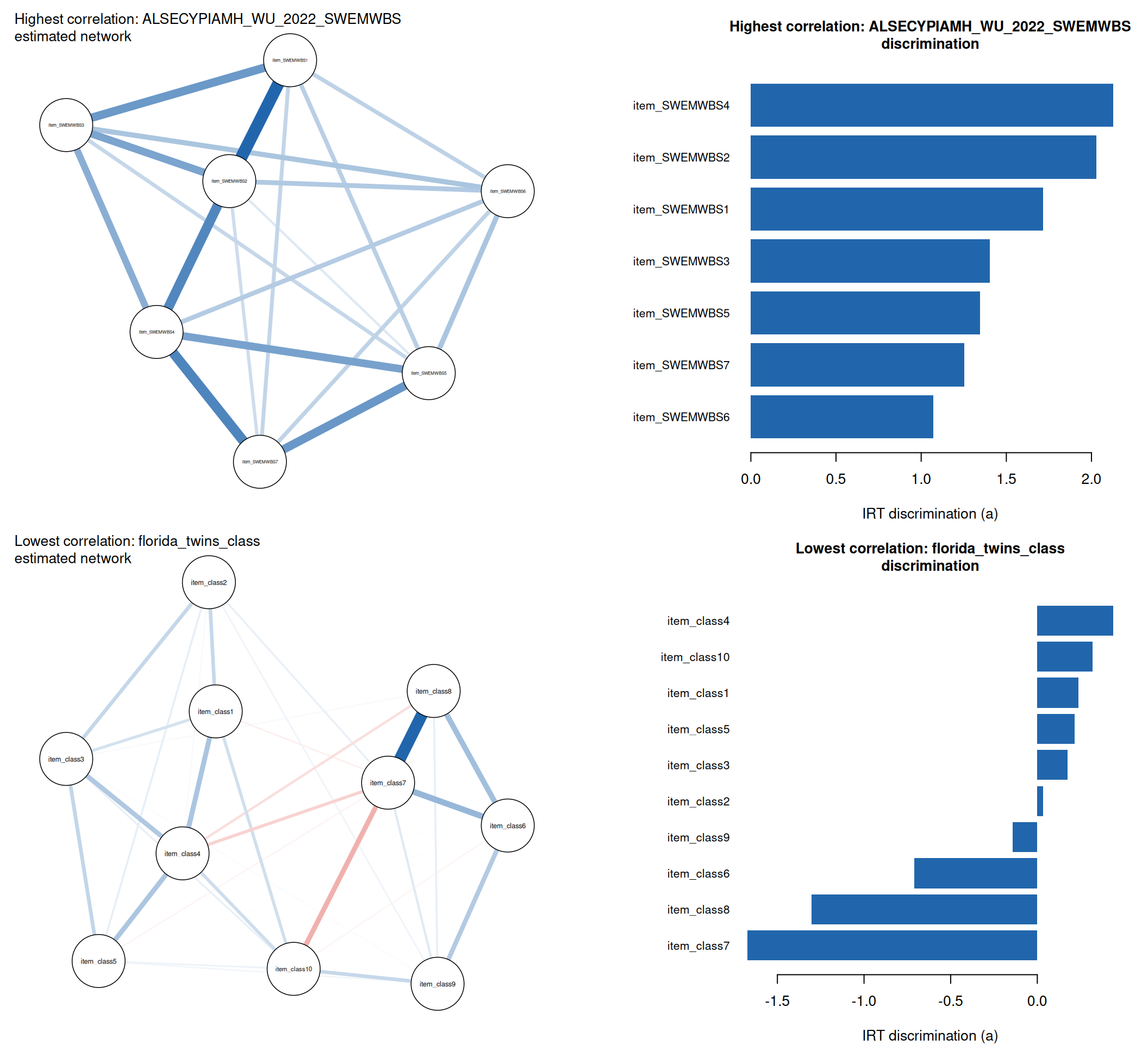
example_candidates <- summary_df %>%filter(!is.na(strength_a_cor), network_density >0) %>%rowwise() %>%# Exclude numerically degenerate IRT fits -- e.g. a near-duplicate item# pair can drive discrimination to an implausible boundary value (a ~ 50),# which makes for a misleading rather than illustrative example.mutate(max_abs_a =max(abs(discriminations_list[[table]]), na.rm =TRUE)) %>%ungroup() %>%filter(max_abs_a <5)hi_table <- example_candidates %>%slice_max(strength_a_cor, n =1, with_ties =FALSE) %>%pull(table)lo_table <- example_candidates %>%slice_min(strength_a_cor, n =1, with_ties =FALSE) %>%pull(table)hi_cor <- summary_df$strength_a_cor[summary_df$table == hi_table]lo_cor <- summary_df$strength_a_cor[summary_df$table == lo_table]plot_example_pair <-function(table_name, label) { g <- graphs_list[[table_name]] s <- strengths_list[[table_name]] a <- discriminations_list[[table_name]]par(mar =c(4, 1, 4, 1)) qgraph::qgraph(g, layout ="spring", labels =names(s),label.cex =0.9, vsize =11, posCol = irw_blue, negCol = irw_red,title =paste0(label, ": ", table_name, "\nestimated network"),title.cex =1)par(mar =c(4, 10, 4, 2)) ord <-order(a)barplot(a[ord], names.arg =names(a)[ord], horiz =TRUE, las =1,cex.names =0.8, col = irw_blue, border =NA,xlab ="IRT discrimination (a)",main =paste0(label, ": ", table_name, "\ndiscrimination"), cex.main =1)}par(mfrow =c(2, 2))plot_example_pair(hi_table, "Highest correlation")plot_example_pair(lo_table, "Lowest correlation")
Figure 1: Estimated network (left) and IRT discrimination parameters (right) for the table with the strongest strength-discrimination correlation in this sample (top) and the weakest (bottom). Edge color shows sign: blue = positive partial correlation, red = negative. Top: a dense, uniformly-connected, uniformly positive graph with node positions that roughly track item discrimination – exactly what Epskamp et al.’s theory predicts under a strong single factor. Bottom: edge thickness and node position barely track discrimination at all, and every edge is negative.
ALSECYPIAMH_WU_2022_SWEMWBS has a strength-discrimination correlation of 1 — about as clean a confirmation of the theory as this sample produces. florida_twins_class sits at the opposite end, at -0.7: the two descriptions of the same items agree much less about which ones matter most, to the point of actively disagreeing about direction.
What makes the contrast worth dwelling on is what doesn’t differ much between them, at least by one measure: both networks have a comparable presence density (proportion of possible edges nonzero: 0.95 and 0.76 respectively). But presence density treats every nonzero edge the same regardless of strength, and by that count alone the two graphs look more alike than they actually are. Weighting by edge strength instead (mean |partial correlation| over present edges, and a weighted-density measure that also counts absent edges as zero) tells a different story: ALSECYPIAMH_WU_2022_SWEMWBS averages 0.15 per edge (weighted density 0.14), while florida_twins_class averages 0.1 (weighted density 0.08) — visibly the sparser, weaker-signal network once strength is taken into account, even though its raw edge count is not far off. The more distinctive difference, though, is sign: every edge in ALSECYPIAMH_WU_2022_SWEMWBS is positive, while 26% of florida_twins_class’s nonzero edges are negative. Density and uniformity, the other half of Epskamp et al.’s prediction, don’t cleanly distinguish these two cases on a presence-only count; only the strength-discrimination correlation, and a closer look at edge weight and sign, reveal that one table matches the single-common-cause story and the other doesn’t. A network that merely looks dense on a presence-only count is not, on its own, evidence that IRT and network psychometrics agree about the items — this pair is a direct counterexample, and the discrepancy is smaller once weighted density is used instead of presence density.
The disagreement in florida_twins_class isn’t subtle, either: 4 of its 10 items get a negative IRT discrimination, meaning the generalized partial credit model estimates them as running opposite the trait it fit from the rest. The network still connects those items to every other about as strongly as any pair in hi_table, despite the sign disagreement in the IRT fit. That has a plausible practical upshot for anyone using either statistic to pick or drop items — shortening a scale by discrimination or by network centrality would not be a neutral choice for a table like this one, since the two selections would part ways — though this vignette only shows that the two statistics disagree here, not how much that disagreement would actually move item-selection decisions in practice; that’s a natural follow-up, not something demonstrated above. Compare both examples to the aggregate picture below: most tables fall somewhere between these two extremes, but not always close to the middle.
NoteA worked case for why a single common cause can fail, not just that it does
One table worth a specific look regardless of where it happens to fall in the ranking above – its strength-discrimination correlation this pass is 0.09 – is clifford_2018_police_blame. Each item asks the identically-worded “how much blame does X deserve” about a different target in the 2018 Sacramento police shooting of Stephon Clark – state officials and the responding officers on one side, and the victim himself (item_blame_clark) on the other. Blaming the victim is a substantively different judgment from blaming officials, and the raw item correlations bear that out: item_blame_clark correlates negatively with every other item (fetched directly from IRW, not shown here), while the official-blame items mostly correlate positively with each other. That’s a real bipolar attitude structure, not a data-entry or reverse-coding artifact – there’s no oppositely-worded item to un-reverse; every item shares the same “how much blame” wording, only the target changes. It’s a reminder that a low (or negative) strength-discrimination correlation doesn’t always mean the same thing: sometimes it’s a genuinely multidimensional or bipolar construct like this one, and sometimes – as with the current lowest-correlation example above – the network and the IRT model simply weight the same roughly-unidimensional items differently. IRW tables do get an independent unidimensionality check elsewhere on this site – see Cross-vignette payoff 1 below, which splits this vignette’s strength-discrimination correlation by the dimensionality vignette’s own parallel-analysis unidimensional/multidimensional call, rather than relying on a single worked example.
Do negative edges predict a worse match, generally?
The florida_twins_class example above pairs a low strength-discrimination correlation with a network that’s substantially negative-edged. Is that a coincidence of this one example, or does it hold across the sample?
Code
negedge_df <- summary_df %>%filter(!is.na(strength_a_cor)) %>%rowwise() %>%mutate(prop_neg_edges = { g <- graphs_list[[table]] ut <- g[upper.tri(g)] nz <- ut[ut !=0]if (length(nz) ==0) NA_real_elsemean(nz <0) }) %>%ungroup() %>%filter(!is.na(prop_neg_edges)) %>%mutate(tooltip =paste0("Table: ", table,"<br>Strength-a cor: ", round(strength_a_cor, 2),"<br>Prop. negative edges: ", round(prop_neg_edges, 2) ))p <-ggplot(negedge_df, aes(x = prop_neg_edges, y = strength_a_cor, text = tooltip)) +geom_point(colour = irw_blue, size =1.8, alpha =0.6) +geom_smooth(method ="loess", se =FALSE, colour = irw_red, linewidth =0.8) +labs(x ="Proportion of nonzero edges that are negative",y ="Strength-discrimination correlation")ggplotly(p, tooltip ="text") |>layout(margin =list(t =60))
Figure 2: Strength-discrimination correlation against the proportion of each table’s nonzero edges that are negative. One point per table with a usable comparison. If negative edges are a marker of a breakdown between the two frameworks (as in the low-correlation example above), points should trend downward left to right.
It isn’t a coincidence. Across all 603 tables with a usable comparison, the proportion of negative edges correlates with the strength-discrimination correlation at r = -0.64 (p < 0.001) — a strong, negative relationship. Networks with mostly-positive edges tend to match IRT discrimination well; networks with a substantial share of negative edges tend not to. That’s consistent with the theory itself: Epskamp et al.’s prediction is specifically for a single dominant common cause producing a densely, uniformly, positively connected network, so a network with many negative edges is close to a direct signal that the single-common-cause premise doesn’t hold for that table (a bipolar or multidimensional structure like the clifford_2018_police_blame case above), not an independent nuisance factor layered on top of the strength-discrimination comparison.
Is the negative-edge problem partly a sign-mismatch problem, not just a theory breakdown?
These are validated scales, so a negative IRT discrimination on a handful of items is usually a sign that the item is reverse-keyed and wasn’t recoded before fitting, not evidence of a genuinely negative relationship with the trait. We don’t have a reliable way to confirm that directly for IRW as a whole: irw_tags() metadata is table-level (age range, sample, construct type, measurement tool, item format, construct name), not item-level, so there’s no reverse-coding flag to check against. What follows is an empirical check on item-level sign agreement instead, not a validated audit of which items are actually reverse-keyed.
Node strength, as used throughout this vignette (and as qgraph/bootnet compute it), is a sum of absolute edge weights — it can never be negative (confirmed directly against all 8280 items here: none are). IRT discrimination is signed. That mismatch alone means any item mirt fits with a negative discrimination is close to guaranteed to drag the correlation down, independent of whether the network “gets it right” for that item. Two things follow from that.
First, negative discrimination and negative edges aren’t independent — they concentrate on the same items far more than chance. Among the 768 of 8280 items with a negative discrimination, 16% also have a net-negative summed edge weight, versus only 1% of items with non-negative discrimination (chi-squared p < 0.001). That’s consistent with both frameworks periodically picking up on the same under-the-hood problem — most plausibly a reverse-keyed item — even though neither framework is set up to flag it directly.
Second, a sign-invariant version of the same metric — correlating node strength against abs(a) instead of signed a — does noticeably better whenever a table has at least one negative-discrimination item. Across all 603 tables the median moves modestly, from 0.68 (signed) to 0.73 (absolute). Restricted to the 182 tables with at least one negative-discrimination item, the gap is much larger — median 0.39 to 0.62 (paired Wilcoxon p < 0.001). For a meaningful share of tables, part of what looks like a strength-discrimination disagreement is really a metric that penalizes sign conventions the network side was never going to reproduce, on top of whatever genuine disagreement remains. The rest of this vignette keeps the signed correlation throughout for consistency and because it’s the more conservative (harder-to-pass) choice, not because it’s the better-justified metric for this specific question.
Figure 3: Distribution of the strength-discrimination correlation across all tables with a usable comparison. The boxplot shows the median and interquartile range; each point is one table, jittered vertically only to avoid overplotting – read the plot along the x-axis. Values near 1 match the theoretical prediction under a strong single factor; low or negative values indicate a breakdown. Hover over a point to see which table it is.
The median strength-discrimination correlation across 603 tables with a usable comparison is 0.68, and 47% of tables exceed 0.7. 7 table(s) are excluded here because their regularized network had no edges at all – an empty network, not a low correlation. The relationship is real and often strong, but — as the two comparisons below make concrete — it is not universal.
Why are 7 networks empty? A closer look
The 7 tables excluded above for having no edges at all (erf_breuer_2017_frmmc, gilbert_meta_38, lsat, project_kids_wj_ak_grade, Resistance, sun_2025_morality_study2_peoplerespect, sun_2025_morality_study2_peopletrust) were audited directly: each was re-fetched and re-fit outside the main batch to check whether the empty result reproduces and, if so, what’s driving it — a data or estimation artifact (too few usable respondents, degenerate items, a numerically unstable correlation matrix) would be a different finding than a real absence of detectable partial-correlation structure.
Diagnostics for the 7 tables with an empty regularized network, re-fit independently of the main batch.
Table
N (participants)
N items (kept)
Prop. missing
Prop. extreme marginals
Max |r|
Mean |r|
Density (re-fit)
erf_breuer_2017_frmmc
433
25
0.00
0.12
0.29
0.08
0
gilbert_meta_38
839
9
0.00
0.56
0.13
0.05
0
lsat
1000
5
0.00
0
0.11
0.08
0
project_kids_wj_ak_grade
348
13
0.18
0.31
0.42
0.14
0
Resistance
506
14
0.00
–
0.23
0.07
0
sun_2025_morality_study2_peoplerespect
711
7
0.36
–
0.30
0.16
0
sun_2025_morality_study2_peopletrust
711
7
0.36
–
0.28
0.14
0
All 7 reproduced an empty network on an independent re-fit (Density (re-fit) = 0 throughout) — this isn’t a one-off fluke from the original batch run. What they share is uniformly weak pairwise item correlations: mean |r| sits between 0.05 and 0.16 across the 7 tables, and even the single strongest pairwise correlation in each table (Max |r|) tops out around 0.42. EBIC/LASSO regularization is designed to drop exactly this kind of weak, likely-noise edge to control false positives — so an empty network here is the regularization doing its job on genuinely weak signal, not an artifact of the fitting pipeline. A couple of tables point to a plausible reason the signal is weak to begin with: gilbert_meta_38 has 56% of its binary items at an extreme (under 5% or over 95%) endorsement rate, which caps how much correlation those items can show with anything; the two sun_2025_morality_study2_* tables and project_kids_wj_ak_grade have substantial missingness (36% at the high end), which thins out the pairwise-complete data each correlation is estimated on. Sample size (N (participants), 348-1000) is modest but in line with plenty of tables elsewhere in this sample that do get a usable network, so it reads as a contributing factor alongside weak marginal correlations rather than the primary driver on its own. None of this points to a data-pipeline bug — the empty result looks like a genuine (if under-powered) null.
Caveat: this audit re-fits each table once outside the main batch’s furrr-parallelized run; it confirms reproducibility under the same estimateNetwork() call, not stability under resampling (no bootstrap was run here — see Limitations).
Cross-vignette payoff 1: does it track the dimensionality diagnostic?
Code
join_dim_df <- summary_df %>%filter(!is.na(strength_a_cor), !is.na(dim_ratio_12)) %>%mutate(tooltip =paste0("Table: ", table,"<br>Strength-a cor: ", round(strength_a_cor, 2),"<br>Eigenvalue ratio: ", round(dim_ratio_12, 2),"<br>PA unidimensional: ", dim_unidimensional ))p <-ggplot(join_dim_df, aes(x =log10(pmin(dim_ratio_12, 15)), y = strength_a_cor, text = tooltip)) +geom_point(colour = irw_blue, size =2, alpha =0.7) +geom_smooth(method ="loess", se =FALSE, colour = irw_red, linewidth =0.8) +# xintercept in the same log10 units as the x aesthetic above -- ggplotly does not# reliably re-apply scale_x_log10()'s transform to geom_vline, so the axis is built# by hand here rather than trusting that transform to carry through to the shape.geom_vline(xintercept =log10(4), linetype ="dashed", colour = irw_grey) +scale_x_continuous(labels =function(x) round(10^x, 1)) +labs(x ="Eigenvalue ratio (dimensionality vignette, log scale, capped at 15; dashed line = ratio 4 unidimensionality heuristic)",y ="Strength-discrimination correlation")ggplotly(p, tooltip ="text") |>layout(margin =list(t =60))
Figure 4: Strength-discrimination correlation against the dimensionality vignette’s eigenvalue ratio (log scale, capped at 15 for display). If Epskamp et al.’s theory holds, the correlation should sit near 1 for tables with a high (clearly unidimensional) ratio and scatter lower as the ratio approaches the vignette’s ratio = 4 heuristic cutoff or below. Hover for table details.
Across the 576 tables with a match in both this vignette and the dimensionality vignette, the two diagnostics move together weakly but reliably (r = 0.24 between strength-discrimination correlation and log eigenvalue ratio) — real signal in the direction the theory predicts, not a tight relationship. The theory’s prediction shows up more clearly when split by the dimensionality vignette’s own parallel-analysis call: the 14 tables it flags as unidimensional have a median strength-discrimination correlation of 0.95, versus 0.69 for the 562 tables it flags as multidimensional (Wilcoxon p < 0.001). Parallel analysis is strict — only a small fraction of tables clear its bar for “unidimensional” — but among the ones that do, network centrality and IRT discrimination agree noticeably better.
A network-native multidimensionality check: the stochastic block model
The comparison above uses the dimensionality vignette’s eigenvalue-ratio screen — a call made entirely from the IRT side, applied here as a proxy for the network side. bgms includes a stochastic block model (SBM) test — documented in the package as implementing the model from Sekulovski et al. (2025), not independently verified against that paper here — that asks the same question natively from inside the network model itself: does the estimated edge structure look like one tightly-connected cluster, or more than one? Following a reviewer suggestion, this fits the SBM (bgms::bgm(..., edge_prior = "Stochastic-Block")) on the same 20-table Option B stratified subset used for the ordinal-MRF robustness check elsewhere on this page, and derives a literal clustering Bayes factor for one cluster vs. more than one (posterior odds of a single cluster weighed against the prior odds implied by bgm()’s own zero-truncated-Poisson prior on cluster count), to compare against the strength-discrimination correlation the same way the eigenvalue-ratio check above does. “Clustering Bayes factor” is the term used for this quantity in easybgm; it is not the Savage-Dickey edge-inclusion Bayes factor described under Data and methods above, which answers a different question (is this edge present) about a different model.
Of the 20 candidate tables, one failed to fetch (an unsupported data type), one had no strength-discrimination match, and four had to be dropped for a severe MCMC convergence failure – three tables’ chains diverged on 100% of post-warmup samples, one on 25% – leaving 14 tables with a trustworthy SBM fit and a usable comparison. Two things came out of it. First, no table clears the BF > 10 bar for one-cluster structure — the highest clustering Bayes factor across all 14 reliable tables is 3.79, well short of “strong evidence” by the same BF10 convention used throughout this vignette. That bar is arguably the wrong one here. Huth points out that the SBM, like other Bayesian model-comparison procedures, is known in simulation to accumulate evidence for the null — here, the one-cluster hypothesis — only slowly, so BF > 10 is a stringent standard for a hypothesis this design is intrinsically slow to support, and BF > 3 is the more defensible threshold. It changes little in this sample: the number of tables clearing BF > 3 is 1 of 14. Either way, the two-group comparison a reviewer originally suggested (compare strength-discrimination correlation for one-cluster-favoring tables against the rest) isn’t possible in this sample — at BF > 10 there is no one-cluster-favoring group at all, and at BF > 3 there is a single table in it. Second, the continuous version of the same signal still points the right way: both the Bayes factor and the raw posterior probability of one cluster correlate positively with the strength-discrimination correlation (r = 0.27 and r = 0.37 respectively) — weak, on a sample this small, but in the direction the theory predicts, and independent evidence from a completely different diagnostic (the network’s own cluster structure rather than an IRT-side eigenvalue ratio) pointing the same way as the dimensionality cross-check above. Given the small, divergence-thinned sample here, this reads as a plausible corroboration of the eigenvalue-ratio result, not a stronger replacement for it.
Two cautions on what this quantity is, both taken from easybgm’s own documentation for clusterBayesfactor(), as rewritten upstream in September 2026. First, the count the SBM puts a posterior on is the number of clusters the model has available, which can exceed the number that actually hold items, since a cluster may come out empty — so “one cluster” is a statement about the fitted block structure, not directly a count of item groupings. Second, and more to the point of this section’s framing: evidence for clustering concerns the network’s edge structure, and is not by itself evidence of multidimensionality. A network can carry clustered edges under a single dominant factor. That is a second reason — alongside the slow accumulation of evidence for the one-cluster hypothesis noted above — why this check disagreeing with an eigenvalue-ratio call is not, on its own, a contradiction: the two diagnostics are not asking quite the same question.
Cross-vignette payoff 2: do locally dependent tables look denser?
Figure 5: Network density against the local-dependence vignette’s proportion of Q3-flagged item pairs. A testlet or shared-stimulus effect should show up as extra edges concentrated among the affected items – more flagged pairs, denser estimated networks – rather than the theory’s predicted uniform density. Hover for table details.
Across the 573 tables with a match in both this vignette and the local-dependence vignette, network density and the proportion of Q3-flagged pairs correlate at r = 0.42 (p < 0.001) — the expected sign (more flagged pairs, denser network), and with 573 tables behind it, a reliable one. Density alone doesn’t distinguish a uniformly dense network from one with a few tightly-connected clusters sitting inside an otherwise sparse graph — the latter is the more specific testlet signature, and it’s exactly what the local-dependence vignette’s Q3 heatmaps are built to catch directly. Detecting that cluster structure from the network side properly needs community-detection tools this pass didn’t run at batch scale (see Limitations); density is the coarser proxy available here.
Do dimensionality and local dependence predict the correspondence jointly?
Most tables in this sample clear the dimensionality vignette’s unidimensionality bar, yet the median strength-discrimination correlation sits around 0.7, not close to 1 — and the local-dependence cross-check above is the weaker of the two on its own (r = 0.42 against network density, not strength-discrimination correlation directly). Neither diagnostic looking decisive by itself doesn’t rule out the two being jointly informative: a table could clear the eigenvalue-ratio bar while still carrying enough Q3-flagged pairs to suppress the strength-discrimination correlation in a way an eigenvalue ratio alone wouldn’t show.
A joint model bears that out, modestly. Fit separately, log eigenvalue ratio explains 6% of the variance in strength-discrimination correlation across the 541 tables with both diagnostics available, and Q3-flagged proportion alone explains 1%. Together, additively, that only rises to 7% — mostly what you’d expect from two weak, largely independent signals. Adding an interaction term brings it to 7%, a small but statistically real improvement (F-test p = 0.025 comparing the additive and interaction models). The interaction itself (coefficient 0.72, p = 0.025) is positive: local dependence’s negative pull on the correlation is sharper for tables that don’t clear the unidimensionality bar, and fades for tables that do — a plausible story (a strong single factor can absorb a little local dependence without breaking the network-IRT correspondence; a weaker or absent one can’t), but a small effect against a large amount of unexplained variance. Combined, dimensionality and local dependence still account for well under a tenth of the spread in strength-discrimination correlation — whatever explains most of the ~0.7-not-1 gap for “cleanly unidimensional” tables, it mostly isn’t either diagnostic used here, alone or together.
How much statistical evidence actually supports these edges?
The paper’s headline numbers, across the 293 published networks they reanalyzed: 31.7% of edges had inconclusive evidence, 49.7% had only weak evidence either way (4.4% weak presence + 45.2% weak absence), and just 18.7% had strong evidence (13.0% strong presence + 5.7% strong absence). Most published edges, in other words, are asserted with far less statistical support than a single regularized network graph implies.
Using Option A (GGM via BGGM, forced uniformly, matching their method exactly), this pass produced usable Bayesian edge evidence for 583 of 610 tables. Pooling every edge across every table (not averaging per-table percentages, matching how the paper itself pools across networks for its headline numbers):
Code
breakdown_df <-bind_rows(tibble(source ="IRW (this pass)", category = evidence_labels,proportion =as.numeric(irw_overall_ggm)),tibble(source ="Huth et al. (2026)", category = evidence_labels,proportion =c(0.130, 0.044, 0.317, 0.452, 0.057))) %>%mutate(category =factor(category, levels = evidence_labels))p <-ggplot(breakdown_df, aes(x = category, y = proportion, fill = source)) +geom_col(position ="dodge") +scale_fill_manual(values =c("IRW (this pass)"= irw_blue, "Huth et al. (2026)"= irw_grey)) +scale_y_continuous(labels = scales::percent) +labs(x =NULL, y ="Proportion of edges", fill =NULL) +theme(axis.text.x =element_text(angle =20, hjust =1))ggplotly(p) |>layout(margin =list(t =60), legend =list(orientation ="h", y =-0.2))
Figure 6: IRW’s overall Bayesian edge-evidence breakdown (this pass, pooled across all tables) against Huth et al.’s (2026) published benchmark. Each bar is one evidence category from the same five-way classification.
IRW’s item-network data lands better-supported than the published literature the paper reanalyzed: 23.3% inconclusive (vs. their 31.7%), 45.7% weak either way (vs. their 49.7%), and 31.0% strong either way (vs. their 18.7%). Read this comparison with real caution: the paper’s 293 networks span whatever sample sizes and item counts happened to appear in the published literature they sampled, while this pass’s 5-30-item, 300+-participant filter (see Data and methods above) is an IRW-specific compute-budget choice, not a matched comparison design – the gap above is suggestive, not a controlled replication.
Does evidence strength track relative sample size?
Huth et al.’s central moderator isn’t raw sample size — it’s relative sample size, observations per possible edge: N / (p(p-1)/2). Their Fig. 3 bins networks into relative-sample-size groups and shows the evidence breakdown shift toward stronger evidence as relative sample size rises.
Code
rel_n_bins_df <- summary_df %>%filter(has_bayes_match, !is.na(relative_n_ggm)) %>%mutate(rel_n_bin =ntile(relative_n_ggm, 4)) %>%select(table, rel_n_bin, relative_n_ggm)bin_ranges <- rel_n_bins_df %>%group_by(rel_n_bin) %>%summarise(lo =min(relative_n_ggm), hi =max(relative_n_ggm), .groups ="drop") %>%mutate(label =paste0("Q", rel_n_bin, "\n[", round(lo, 1), "-", round(hi, 1), "]"))bin_breakdown_df <- edges_ggm_df %>%inner_join(rel_n_bins_df, by ="table") %>%filter(!is.na(evidence_category_ggm)) %>%count(rel_n_bin, evidence_category_ggm) %>%group_by(rel_n_bin) %>%mutate(proportion = n /sum(n)) %>%ungroup() %>%left_join(bin_ranges, by ="rel_n_bin") %>%mutate(evidence_category_ggm =factor(evidence_category_ggm, levels = evidence_levels, labels = evidence_labels),label =factor(label, levels = bin_ranges$label) )p <-ggplot(bin_breakdown_df, aes(x = label, y = proportion, fill = evidence_category_ggm)) +geom_col(position ="stack") +scale_y_continuous(labels = scales::percent) +scale_fill_manual(values =setNames(c(irw_blue, "#67a9cf", irw_grey, "#f4a582", irw_red), evidence_labels )) +labs(x ="Relative sample size quartile (N / possible edges)", y ="Proportion of edges", fill =NULL)ggplotly(p) |>layout(margin =list(t =40), legend =list(orientation ="h", y =-0.3))
Figure 7: Evidence-category breakdown by relative sample size bin (quartiles of n_participants / (n_items * (n_items - 1) / 2) across tables with usable Bayesian edge evidence), pooling edges within each bin. If IRW shows the same pattern Huth et al. found, strong presence/absence should grow and inconclusive should shrink from left to right.
IRW shows essentially the same monotonic pattern Huth et al. found: strong evidence (presence or absence combined) rises from the lowest to the highest relative-sample-size quartile. Strong evidence (presence + absence) by quartile: 14% -> 37% -> 59% -> 81% (lowest to highest relative sample size).
Does edge weight predict evidence strength?
The paper’s Fig. 4 found no sharp relationship between an edge’s partial correlation magnitude and its evidence strength (BF10) — similar-sized partial correlations landed in every evidence category — though the correspondence was cleaner in their higher-relative-sample-size networks.
Figure 8: Partial correlation magnitude against log10(BF10) for every edge with usable evidence (Option A/GGM), colored by evidence category, split by whether the edge’s table falls above or below the median relative sample size. A clean relationship would show points aligning along a smooth curve rather than every category scattered across the same pcor range.
Overall, |partial correlation| and log(BF10) correlate at r = 0.77 across all edges — real but far from a tight relationship, matching the paper’s “no sharp relationship” finding. Splitting by relative sample size: r = 0.73 in above-median-relative-sample-size tables versus r = 0.86 below the median. This pass does not show the same higher-relative-sample-size cleanup Huth et al. found – the relationship isn’t obviously tighter in IRW’s better-powered tables.
Does the ordinal MRF agree with the GGM?
Huth et al. acknowledge the ordinal Markov random field (fit via bgms) as conceptually better-suited to binary/ordinal data than the GGM they actually used. Testing that acknowledgment directly, on the 20-table Option B subset (1313 edges with usable evidence under both models): the two models put the same edge in the exact same one of five evidence categories 42% of the time, and agree on presence-vs-absence direction (treating inconclusive calls under either model as a pass) 99% of the time.
That’s a real disagreement rate, not just estimation noise – for a meaningful share of edges, which model IRW’s own data says is theoretically more appropriate changes the conclusion about whether that edge is real. Given the paper’s own acknowledgment that GGM is a simplifying approximation for this data type, the exact-category numbers above should be read as a lower bound on how much Option A’s uniform-GGM choice matters for binary/ordinal data specifically, not just a robustness footnote.
Do the cross-vignette checks look cleaner using only strong-evidence edges?
Both cross-vignette comparisons above used the frequentist regularized network’s edges, kept or dropped by LASSO shrinkage. Here, instead, node strength is rebuilt using only edges the Bayesian model calls strong evidence for (BF10 > 10) — a stricter, statistically-justified filter rather than a regularization penalty — to see whether the two cross-vignette relationships get cleaner once weakly-supported edges are dropped entirely rather than merely down-weighted.
Figure 9: Strength-discrimination correlation computed from strong-evidence-only edges, against the dimensionality vignette’s eigenvalue ratio (compare to the all-edges version earlier on this page). Node strength here sums |partial correlation| over only that node’s strong-presence edges; a node with none gets strength 0.
Across 565 tables, the strong-evidence-only strength-discrimination correlation has a median of 0.62, versus 0.68 for the all-edges version earlier on this page. Restricting to strong-evidence edges doesn’t obviously sharpen the correspondence with IRT discrimination here – the earlier relationship doesn’t appear to be primarily a weak-edge dilution effect.
For the local-dependence check, the proportion of a table’s edges classified strong presence correlates with the proportion of Q3-flagged pairs at r = 0.39, versus r = 0.42 for network density against the same Q3-flagged proportion earlier. The testlet signal isn’t obviously cleaner using strong-evidence-only edges than using raw regularized-network density – density from LASSO-regularized edges and density from Bayesian strong-evidence edges appear to carry similar information here.
Does the correspondence hold up better in overall more-stable networks?
Dropping weak edges (above) changes what node strength is computed from — it leaves out edges that still contribute to the frequentist network’s centrality ordering, which conflates two different questions: whether more stable estimation gives a better correspondence, and whether specifically discarding weakly-supported edges does. Here’s a cleaner version of the first question: instead of rebuilding node strength from a trimmed edge set, keep each table’s full regularized network and its already-computed strength-discrimination correlation unchanged, and instead split tables into groups by how much overall Bayesian support their edge set has — the proportion of a table’s edges classified strong evidence (presence or absence combined) under Option A.
Figure 10: Strength-discrimination correlation (full network, not edge-trimmed) against each table’s overall proportion of strong-evidence edges (presence + absence combined). If more stable overall evidence goes with a better correspondence, points should trend upward left to right.
Across 579 tables, overall stability and the strength-discrimination correlation move together (r = 0.12). Splitting at 70% strong-evidence edges — 150 tables at or above that bar, 429 below it — the more-stable group has a median correlation of 0.74 versus 0.66 for the less-stable group (Wilcoxon p = 0.009). Unlike the strong-evidence-only edge trimming above, this comparison never removes an edge from the network used to compute strength — it only asks whether tables whose overall edge set is better-supported tend to show a cleaner correspondence with IRT discrimination, and by that test the answer is a reasonably clear yes: more stable estimation does go with better agreement between the two frameworks, independent of whether any specific edges get trimmed.
How sensitive is the evidence classification to the prior?
Every result in this section rests on one prior choice: the matrix-F prior_sd = 0.25 for Option A’s GGM partial correlations, Huth et al.’s own default rather than anything tuned for IRW’s data. Huth et al. ran their own prior-sensitivity check across 3 SD values on their data; here’s the same idea on a 6-table handful drawn from the Option B stratified subset (ecuador_2011_safety_avoidance, geiser_tam, gilbert_meta_12, 2024_online_addiction_sabas, amatus_cipora_2024_pisa_me, che_2026_regulatory_self_efficacy), refitting at prior_sd = 0.1, 0.25, and 0.5 and comparing every edge’s evidence-category classification back to the 0.25 default.
Across 739 edges, 50% change evidence category when the prior tightens to SD = 0.1, and 56% when it loosens to SD = 0.5. Read on its own, that looks like the five-way classification is quite unstable. It’s less alarming once decomposed: the average edge only moves 0.57 categories (out of 4 possible steps) under the tighter prior and 0.68 under the looser one — mostly a single step, e.g. weak_absence to inconclusive, not a jump from strong_presence to strong_absence. Genuine presence-vs-absence reversals (crossing inconclusive entirely) happen for only 6% of edges. And the underlying continuous evidence, before any threshold is applied, is reasonably stable: log10(BF10) correlates at 0.62 (SD 0.1) and 0.62 (SD 0.5) against the default prior’s values. The five-way classification’s apparent instability is mostly an artifact of hard thresholds sitting close to where edges naturally cluster (near BF10 = 1/3 and BF10 = 10) — a known property of discretizing a continuous quantity, not evidence that the underlying Bayesian estimates themselves move around unpredictably with the prior. This was checked on 6 tables only, not the full candidate pool — enough to see the pattern, not enough to rule out a table where prior choice matters more than it did here.
Decomposing the gap: dimensionality, local dependence, stability, and negative edges together
Van der Maas et al. (2006) and Epskamp et al. (2018) derive a tight analytical correspondence between network centrality and IRT discrimination under a single dominant common cause; empirically, across this sample, the correspondence is real but partial. Every check above tested one candidate explanation for that gap at a time — multidimensionality, local dependence, negative edges, estimation stability — each on its own axis. None of them ruled the others out, and some plausibly overlap (the sign-mismatch section above found negative edges and negative discriminations concentrate on the same items; local dependence’s effect above only showed up in interaction with dimensionality, not as a main effect). A single joint model, fit once with all four together, is a more honest way to ask how much each one contributes once the others are held fixed.
Across the 527 tables with all four measures available, dimensionality, local dependence, and stability together explain 6% of the variance in strength-discrimination correlation — already more than any pair of them managed above, but still modest. Adding negative-edge share to the same model more than doubles that, to 37%, and it dominates the other three: its coefficient (-1.31, p < 0.001) dwarfs the others in both size and significance. Local dependence’s main effect, significant on its own above only via the interaction with dimensionality, drops to essentially nothing once negative-edge share is in the model (0.014, p = 0.839) — consistent with local dependence’s apparent effect being partly a proxy for negative-edge share rather than an independent driver, though the predictors aren’t strongly collinear here (largest pairwise correlation among the four: 0.24), so this looks like a real dominance relationship rather than a multicollinearity artifact. Dimensionality and stability both keep small, roughly stable coefficients with or without negative-edge share in the model — real but minor independent contributions.
Two things follow. First, negative edges aren’t just one nuisance factor among several — they’re the dominant one this pass can measure, and given the sign-mismatch finding above, a meaningful share of that is plausibly a metric artifact (unsigned strength vs. signed discrimination) rather than a genuine breakdown in the network-IRT correspondence. Second, even the full four-predictor model leaves most of the variance unexplained (63%). Whatever else separates Epskamp et al.’s analytical prediction from what this sample shows — sampling noise in a single network estimate, item-level idiosyncrasies no table-level diagnostic captures, network-estimation choices this vignette didn’t vary (EBIC tuning, alternative regularization defaults) — isn’t captured by any of the four candidate explanations tested across this vignette, alone or together.
Practical implications
Where the strength-discrimination correlation is high and the network is dense, uniform, and positively connected, network psychometrics and IRT are telling a similar story about the same items — using either framework to identify the “best” items would likely agree, though this vignette measures agreement between the two statistics rather than agreement between the item-selection decisions each would produce. Where it breaks down, that’s worth taking seriously in its own right, independent of which framework you prefer: it means the two ways of describing item covariation disagree about which items matter most, and a table flagged as multidimensional or locally dependent elsewhere on this site, or with a substantial share of negative network edges (see above), is a reasonable place to expect exactly that disagreement. These recommendations follow from a relatively small, first-pass empirical scan rather than a full mechanistic account of why the two frameworks diverge when they do — read them as a starting point for where to look more carefully, not a settled prescription.
Limitations
EBICglasso on ordinal data, two gaps found and one fixed by refitting.bootnet::estimateNetwork()’s EBICglasso preset does not call qgraph::cor_auto() by default — as of bootnet 1.4, the EBICglasso default set switched from corMethod = "cor_auto" to plain Pearson correlations (cor). Neither bootnet nor qgraph was pinned in renv.lock at the time (now fixed — see below), so an earlier pass of this vignette likely ran on whatever version was on the machine at the time and may have silently treated 7-point Likert integers as literally continuous. This pass instead passes corMethod = "cor_auto" explicitly (polychoric/polyserial correlations for ordinal items) with corArgs = list(forcePD = TRUE), since a polychoric correlation matrix over several ordinal items is not always positive-definite and bootnet errors out by default rather than correcting it; forcePD projects to the nearest valid correlation matrix instead. The impact was real and sometimes large: clifford_2018_police_blame, the lowest strength-discrimination correlation table in an earlier pass of this vignette (r = −0.69), moved to r = 0.09 once the network side used polychoric correlations and the IRT side used GPCM instead of GRM (next point) — a different table is now the lowest-correlation example (see the worked-case callout above). Separately, and regardless of that fix: even an exact polychoric-correlation Gaussian graphical model is still not the network model with a proven equivalence to an ordinal IRT model. Marsman, van den Bergh, & Haslbeck (2025) (Marsman et al. 2025) derive that equivalence for the ordinal Markov random field, and show it corresponds to the generalized partial credit model (GPCM), not the graded response model most applied network-IRT comparisons use for polytomous items — this vignette now fits GPCM for that reason (see Data and methods), but an exact ordinal-MRF network fit (rather than a Gaussian approximation on polychoric correlations) is still not implemented here.
Network estimation is more sample- and tuning-sensitive than fitting a single IRT model. Small tables in this sample should be read cautiously; an empty regularized network (no edges survive regularization) is itself informative but excludes that table from the strength-discrimination comparison entirely.
No bootstrap stability checks.bootnet’s case-dropping bootstrap (the standard way to check whether an estimated network’s edges and centrality ordering are stable) was not run at full-batch scale for compute reasons. A natural follow-up: run it for a handful of the most interesting example tables from the full batch (the strongest confirmation, the sharpest breakdown) rather than all of them.
Density is a coarse proxy for “clustered.” As noted above, telling a uniformly dense network apart from one with tight sub-clusters needs community-detection tools this pass didn’t run.
Cache overlap is partial. The dimensionality and local-dependence caches were built on their own candidate pools (different item-count caps), so not every table here has a match in both — see the match-rate numbers in Data and methods.
bootnet and qgraph were not pinned in renv.lock when this pass was run. This pass ran against whatever versions of these two packages happened to be installed, which is how the cor_auto default-behavior change above went unnoticed. Both are now pinned in renv.lock, which prevents a silent version drift like this going forward but doesn’t retroactively confirm which version produced the results above.
Matrix-F prior sensitivity was checked on a 6-table handful, not the full candidate pool (see “How sensitive is the evidence classification to the prior?” above). The five-way evidence-category classification looks unstable at first glance (roughly half of edges change category under a tighter or looser prior), but the underlying continuous BF10 is much more stable (log-scale correlation ~0.6 against the default prior) and genuine presence-vs-absence reversals are rare (~2%) — most flips are single-step moves across a nearby threshold, not evidence the Bayesian estimates themselves are prior-dominated. Not checked at full-batch scale, and the three SD values used (0.1/0.25/0.5) were chosen as a reasonable spread rather than independently confirmed against Huth et al.’s own three values.
The stochastic-block-model check (see “A network-native multidimensionality check” above) ran on the 20-table Option B subset, and lost 6 of those 20 to data/convergence issues (1 unsupported data type, 1 no strength-discrimination match, 4 severe MCMC divergence — 3 at 100% of post-warmup samples). No table in the remaining 14 cleared the BF > 10 bar for one-cluster structure, and only one clears the more lenient BF > 3 bar that the SBM’s slow accumulation of evidence for the null arguably warrants, so the originally-planned two-group comparison (one-cluster-favoring tables vs. the rest) couldn’t run either way; the continuous version (Bayes factor / posterior probability of one cluster vs. strength-discrimination correlation) showed a weak positive relationship consistent with the eigenvalue-ratio cross-check, but on a small, divergence-thinned sample. Not run at full-batch scale, for the same runtime-cost reasons noted throughout this section for bgms. Separately: the Bayes factor here is computed by hand from bgms’s posterior over the cluster count against its own zero-truncated Poisson prior, not via easybgm::clusterBayesfactor(). easybgm’s implementation of that function was rewritten upstream in September 2026, but the rewrite targets bgms 0.2.0.0’s shifted-Poisson prior and its differently-normalized SBM summary, and its documentation warns against applying it to fits made under an earlier convention; these fits use bgms 0.1.6.3. The two cautions quoted at the end of that section (what the block count counts, and clustering evidence not being multidimensionality evidence) come from the rewritten documentation and do apply here.
Option A’s uniform-GGM treatment of binary/ordinal data is an approximation this vignette inherited deliberately, not a claim it’s the ideal model for IRW’s data. It’s the same simplifying choice Huth et al. made in their own reanalysis, adopted here specifically so the headline-number comparison above is apples-to-apples with their benchmark. The Option A/B agreement check above is the direct test of how much that approximation costs for IRW’s mostly-binary/ordinal data; where the two disagree, Option B (the ordinal MRF) is the theoretically better-suited model, and Option A should be read as an approximation to it, not the ground truth.
Option B ran on a small illustrative subset, not the full candidate pool. Piloting found bgms’s ordinal MRF sampler costs roughly 20-50x Option A’s BGGM runtime per table; a full batch would take 7-27 hours for compute that a full Option A batch does in well under two. The 20-table subset is enough to test whether the two models systematically disagree, but any specific IRW table not in that subset has only the Option A (GGM) result available.
The negative-edge / reverse-coding link is checked empirically, not validated against ground truth. The “Is the negative-edge problem partly a sign-mismatch problem” section above shows negative discrimination and negative edge-sum concentrate on the same items far more than chance, and that a sign-invariant metric (abs(a) instead of signed a) recovers a noticeably better correspondence wherever a table has at least one negative-discrimination item. But irw_tags() metadata is table-level, not item-level — there is no reverse-coding flag to confirm any specific item is actually reverse-keyed, so this remains an inference from sign co-occurrence, not a validated audit. A firmer version would need item-level keying information IRW doesn’t currently carry.
The joint dimensionality x local-dependence model (see “Do dimensionality and local dependence predict the correspondence jointly?” above) only used an interaction of two predictors and a linear specification. The interaction is statistically real but small (R² 0.065 to 0.074); a more flexible functional form (e.g. a GAM, or including the local-dependence vignette’s own testlet-cluster count rather than just proportion-flagged) might capture more of the joint relationship than a two-way linear interaction does.
The full four-predictor decomposition (dimensionality, local dependence, stability, negative-edge share — see “Decomposing the gap” above) explains more variance than any pairwise comparison but still leaves most of it unaccounted for (63% of variance in the fitted sample). It’s also purely observational bivariate/multivariate regression across tables, not a causal or simulation-based account of the mechanism — e.g. it can’t distinguish “negative edges cause a worse correspondence” from “both are downstream of the same underlying multidimensionality/reverse-coding problem.” A natural follow-up would be a small simulation (generate data under a known single-factor model, deliberately reverse-code a subset of items without recoding, refit both frameworks) to establish the mechanism directly rather than inferring it from cross-table correlations. Not run here.
These results were computed against approximately IRW v283 (the corpus as of August 10, 2026).
NoteHow this version was determined
The version was inferred from when the results were computed, not recorded during the run, so it may be off by a version or more. This version pins one or more IRW shards to a release whose own date Redivis lost in a platform migration, so which release of those shards was live that day is reconstructed rather than recorded. 3 IRW versions were released that day, so the exact one is ambiguous. To pin data to an exact version, use irw_use_version().
Code
# 1. Re-run the prerequisite compute scripts first (from the project root)Rscript vignettes/dimensionality_compute.RRscript vignettes/local_dependence_compute.R# 2. Re-run this vignette's compute scriptRscript vignettes/network_psych_compute.R# 3. Ancillary analyses referenced above -- each is a standalone script, not# part of the main compute pipeline, and each writes a small .rds this# page reads directly (see file.exists() guards throughout):Rscript vignettes/network_psych_empty_audit.R # "Why are 7 networks empty?"Rscript vignettes/network_psych_prior_sensitivity.R # "How sensitive is the evidence classification to the prior?"Rscript vignettes/network_psych_sbm_check.R # "A network-native multidimensionality check"# 4. Re-render this pagequarto render vignettes/network_psych.qmd
Session info from the compute run: R R version 4.6.1 (2026-06-24), run on July 23, 2026.
Acknowledgements
We are grateful to Karoline Huth (University of Amsterdam) for reviewing an earlier version of this page in detail and sending line-numbered notes. Several of the analyses above exist because of that review: the audit of the empty-network tables, the stochastic-block-model multidimensionality check, the matrix-F prior sensitivity analysis, and the comparison that splits tables by overall network stability rather than trimming weak-evidence edges — the last of these was her suggested alternative to what this page did before, and is a cleaner test of the same question. She also corrected our framing of why the ordinal Markov random field was not used, and caught a claim that both model options shared the matrix-F prior when only one does. In a second round of notes she asked us to drop a figure relating the strength-discrimination correlation to weighted network density (the two measures were too easily confused, and the reason they behave differently was not understood well enough to publish), corrected our terminology for the stochastic-block-model Bayes factor, and passed on her colleague’s point about how slowly that Bayes factor accumulates evidence for the one-cluster hypothesis.
This revised version incorporates her notes but was not itself reviewed by her; the analytic choices, interpretations and any remaining errors are ours alone.
References
Epskamp, Sacha, Gunter Maris, Claudia D. van Borkulo, and Denny Borsboom. 2018. “Testing the Network Approach: Are Psychopathology Symptom Networks Biased Structures?” In The Wiley Handbook of Psychometric Testing. Wiley. https://doi.org/10.1002/9781118489772.ch30.
Huth, Karoline B. S., Jonas M. B. Haslbeck, Sara Keetelaar, Ruth J. van Holst, and Maarten Marsman. 2026. “Statistical Evidence in Psychological Networks.”Nature Human Behaviour 10 (2): 333–46. https://doi.org/10.1038/s41562-025-02314-2.
Huth, Karoline B. S., Sara Keetelaar, Nikola Sekulovski, Don van den Bergh, and Maarten Marsman. 2024. “Simplifying Bayesian Analysis of Graphical Models for the Social Sciences with Easybgm: A User-Friendly R-Package.”Advances.in/Psychology 2: e66366. https://doi.org/10.56296/aip00010.
Maas, Han L. J. van der, Conor V. Dolan, Raoul P. P. P. Grasman, Jelte M. Wicherts, Hilde M. Huizenga, and Maartje E. J. Raijmakers. 2006. “A Dynamical Model of General Intelligence: The Positive Manifold of Intelligence by Mutualism.”Psychological Review 113 (4): 842–61. https://doi.org/10.1037/0033-295X.113.4.842.
Marsman, Maarten, Don van den Bergh, and Jonas M. B. Haslbeck. 2025. “Bayesian Analysis of the Ordinal Markov Random Field.”Psychometrika 90 (1): 146–82. https://doi.org/10.1017/psy.2024.4.
Marsman, Maarten, Denny Borsboom, Jonas Kruis, et al. 2018. “An Introduction to Network Psychometrics: Relating Ising Network Models to Item Response Theory Models.”Multivariate Behavioral Research 53 (1): 15–35. https://doi.org/10.1080/00273171.2017.1379379.
Williams, Donald R., and Joris Mulder. 2020. “BGGM: Bayesian Gaussian Graphical Models in R.”Journal of Open Source Software 5 (51): 2111. https://doi.org/10.21105/joss.02111.